
One of the more interesting and encouraging bits of news that emerged a couple of years ago as I was getting back into film photography was the initiation of an effort to save machinery and restart production of transparency film by Ferrania in Italy. Though the project has been fraught with a number of unforeseen challenges, it is moving forward at a better pace now, and is showing signs of emerging at some point hopefully within the year.
As a result of this, the "Ferrania" name carries a significantly higher profile than it did during the 1990's onward, when it was largely a "private label" film maker that produced many "store brand" films until about 2007 or so, when its production lines shut down. In addition, Ferrania produced branded film as well, but this typically was marketed under the "Scotch" and later "Imation" lineups. I took a lot of shots in the early 1990's on a private label "Seattlechrome" brand that I suspect may well have been made by Ferrania.
While I've managed to find a decent amount of Ferrania color negative films over the past year under various labels over the past year, the slide film product that Ferrania now seeks to replicate for its new product had been pretty elusive in searches on ebay. I HAD been able to find a single roll of Imation Chrome 100 early last Summer that I excitedly snapped up in hopes it would give me a vague idea of how the forthcoming film will look.
I split the roll between my Ricoh 520M CDS and the Olympus OM-2, with shots on the former taken on a Maine trip, and shots on the latter taken locally. I anticipated there may be an extreme amount of color shifting, and some loss of speed, so I rated it around ISO 80 and hoped for the best. The results from this 12 year old film, while not pristine, were appreciably better than I'd feared they might be. The film had a slight amount of grain, and some color shifting towards the blue end of the spectrum, but didn't look nearly as shifted as the 2008 vintage Ektrachrome I took along to Oregon in 2015. Here are samples of 12 year old Imation Chrome with some degree of post processing...

Loaded first into the Ricoh 520M, I had a lovely day before me to see what the Imation Chrome would do. The color rendering is exceptionally on the cold side, but contrast and detail remain adequate.

Despite an overall cool cast, it seems that neutral areas carried a bit of a "parchment" tone on some images.

Two images taken back to back show some differences in sky tones in particular, no doubt an offset of the scans, but both sort of remind me of a nostalgic faded Ektachrome slide.


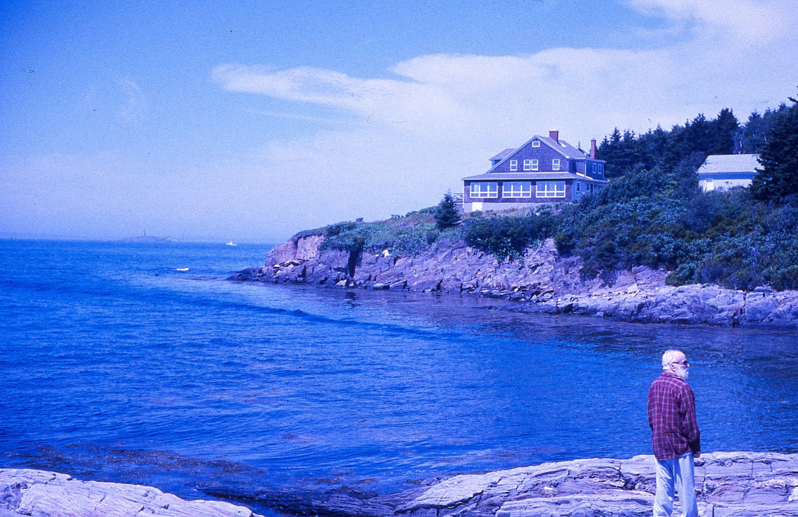
Interestingly, green and reddish tones rendered pretty well with this film. The foliage in foreground looks particularly natural if a bit contrasty.
Left to the color balance of the slide itself, this is how the Imation Chrome shot this particular scene.

For this one, I did a bit of remedial color balancing, and got a particularly punchy result. The image is still a touch on the cool side, but the color vibrance is quite nice.

A necessary reminder that this is land's end. A bit of a rose hue permeates this shot.

A scene which lacked a whole lot in the way of color rendered quite interestingly, almost looking like a selective color mode on a digital camera. The boats in foreground and red apparel are the only colors that pop.
- - - - - - - - - - - - - - - - - - - - - -

Switching to the Olympus OM-2 to complete the roll, and knowing nothing about what sort of results I might get, I hoped for the best with this shot, and was more or less pleased. The result gives off an aged feel that complements the subject matter.

A more vibrant scene under less intense light shows a pleasant softness to the color palette. The OM-2 nicely picked up both foreground and distant elements with proper exposure.

An early morning shot shows a surprisingly vibrant rendering on this old film. Had I known this, or had I a spare roll, I might have set aside the entire roll for dawn and dusk images!

Or not... This late evening scene has lovely sky rendering, but a really flat and lifeless foreground.

A pair of shots with differing focus points and apertures both show the slight parchment toning evident in many of the shots. The result still manages to look pretty nostalgic.


One last summer time shot taken in shadow came out surprisingly well given the lack of light.
Although my results from this roll of film won't give me a verbatim idea of how the new film will render colors, this sample did make for a nice exercise. I was actually quite pleased at how the colors rendered and while there was certainly a shift in color balance, it wasn't excessive, or towards an unflattering hue.
I've periodically looked for another roll or two of this film and have had little to no luck finding much of anything. For now, I guess I'll need to be patient as I continue the waiting game as I look forward to the forthcoming Ferrania color slide film to make its debut!
I've periodically looked for another roll or two of this film and have had little to no luck finding much of anything. For now, I guess I'll need to be patient as I continue the waiting game as I look forward to the forthcoming Ferrania color slide film to make its debut!
No comments:
Post a Comment